It's time to branch out, just a bit.
While I've been on the Obsidian grind for some time now, I hesitate to make my content too niche. This is productnook after all– and I'm not about to shoehorn myself into a self-perpetuating writer's block by limiting my scope to just one product.
Note-taking is and will always be an essential part of my day-to-day, though at present I'm (dare I say) happy with my current setup and configuration, and it would be a disservice to not talk about everything else that drives my daily workflows outside of the world of Obsidian.
I find a lot of readers desire Obsidian to be a one-stop shop– it is for some things, and can certainly be stretched for others, but it can't (and shouldn't) do everything. There are some tasks that dedicated software delivers on that any potential omni-tool cannot, and I think especially spectacular software deserves to be talked about. Software is abundant, but there are only a select few that stand-out from the crowd.
These apps are beautiful, practical, and powerful, all of the ingredients for good Product. It's the makeup of a delightful user experience– and I'm all about it. Even Obsidian's own CEO touches on topic.
Note: This content isn't sponsored. However, if you click on links provided, I may earn a small commission.
So let's kick things off with Screen Capture software. Simple, straight-forward, and already bundled with your Operating System. "Why take it further?" you might ask, and I'm guessing that that's the very same question the folks over at MTW raised when they began developing CleanShotX.
The answer was probably along the lines of "Because we can do it better." At least, that's how I'd think about things when entering a space dominated by free alternatives. Wishful thinking? Perhaps– but in my experience, they achieved what they set out to do.
There are a ton of features out of the box, but what exactly sets it apart from what's already baked in? Which features are most useful?
Let's dive in.
Beautiful, Customizable Backgrounds
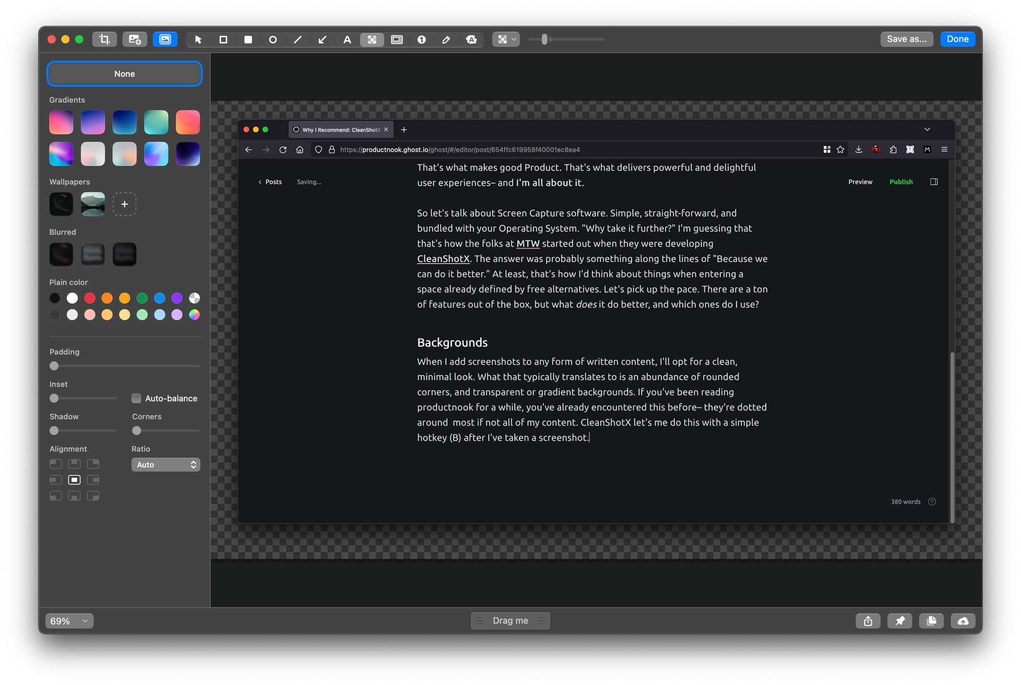
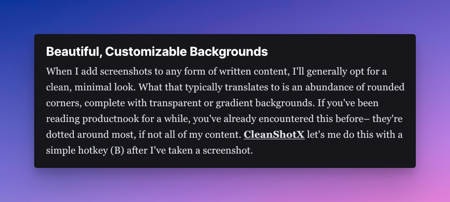
When I add screenshots to any form of written content, I'll generally opt for a clean, minimal look. What that typically translates to is an abundance of rounded corners, complete with transparent or gradient backgrounds. If you've been reading productnook for a while, you've already encountered this before– they're dotted around most, if not all of my content. CleanShotX let's me do this with a simple hotkey (B) after I've taken a screenshot.
Taking a Screen Capture of a Screen Capture App is Weird
The background section let's me choose a premade gradient, a transparent background, my current wallpaper, or another image entirely. I can then opt to blur any of those options, or simply select a plain color to replace any of the above. In addition, I can manipulate the screenshot with padding, inset, and shadows. In reality, I usually just alter the corners a bit. Yes it's a common design trend, but it definitely gives off that "comfy" aesthetic that those hard edges just can't get behind.
Redactions and Spotlighting
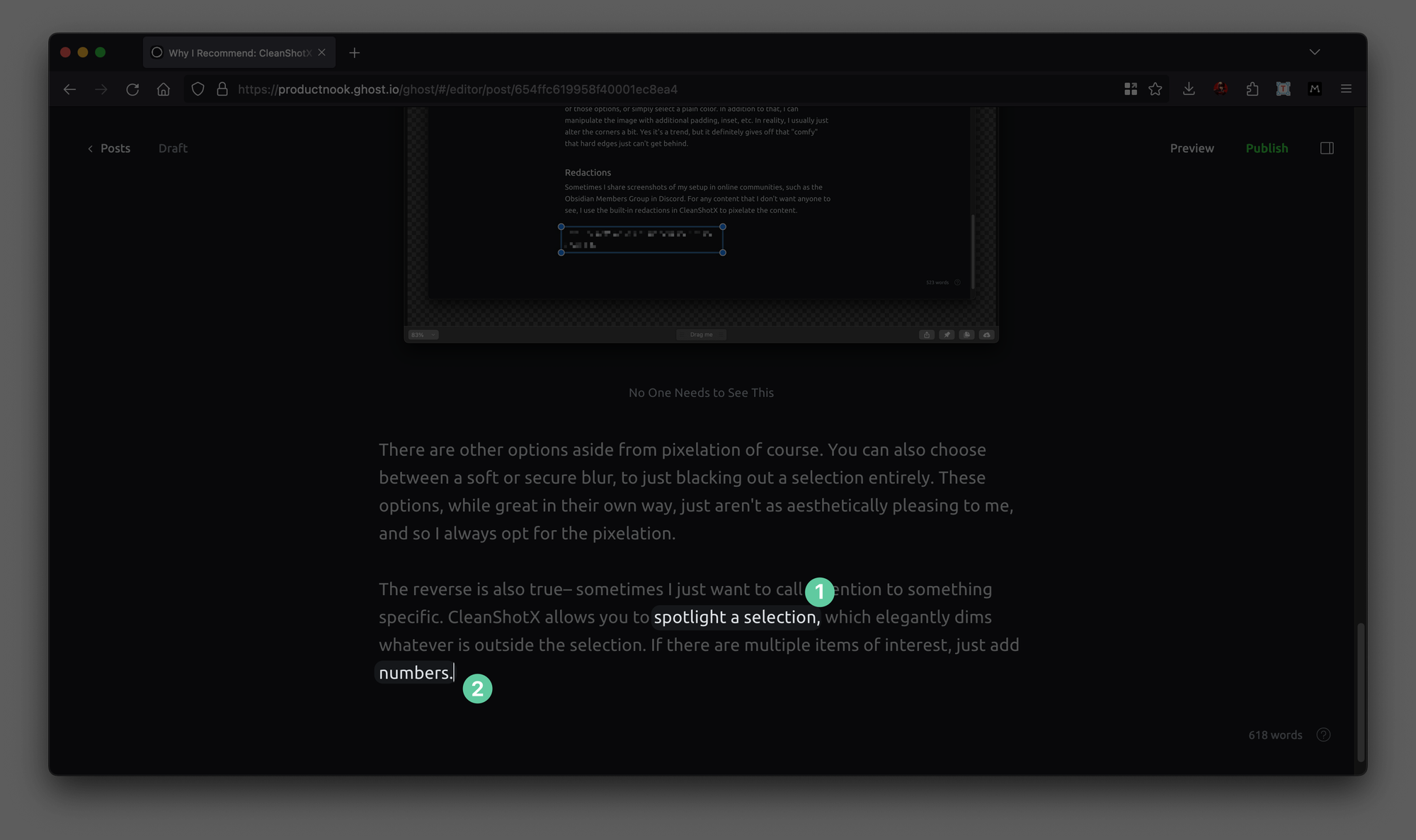
Sometimes I'll share screenshots of my setup in online communities, such as the Obsidian Members Group in Discord. For any content that I don't need anyone seeing, I use the built-in redactions (P) in CleanShotX to pixelate the content.
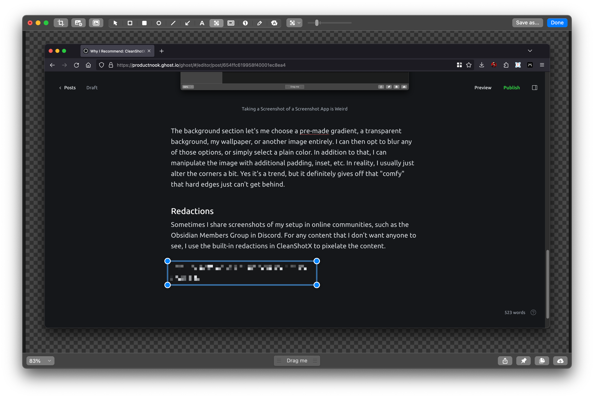
There are other options aside from pixelation of course. You can also choose between a soft or secure blur, to just blacking out a selection entirely. These options, while great in their own way, just aren't as aesthetically pleasing to me, and so I always opt for the pixelation.
The reverse is also true– sometimes I just want to call attention to something specific. CleanShotX allows you to spotlight (H) a selection, which elegantly dims whatever is outside the selection. If there are multiple items of interest, just add numbers (yes, you can alter the number format here as well).
It's the quantity of these subtle but impactful elements that make it clear that a more user-centric approach was at the forefront of development. In other apps, when such seemingly obvious features are otherwise lacking, you might feel that that attention to detail could have made it that much better.
The Scrolling Capture: Show Off Those Walls of Text
Sometimes, one horizontal sized screenshot doesn't have everything you want to share. That's where the Scrolling Capture comes in, which takes a vertical capture. You can scroll manually while capturing, or use the built-in auto-scroll. This is excellent for a number of things:
- Conversations or Snippets: Think lengthy Discord threads where you don't want to share the link, or code snippets that are unlikely to be copied.
- UX and Design: At work, I do a lot of QA. I can use a Scrolling Capture to capture the full length of the content, and then point out the individual front-end components that need touching up with the spotlight feature.
It's best to see it in action:
Scrolling Capture Demo
Video and GIF Recording
Previously, I was using MacOS' built-in screen recording tools to record and share the contents of my screen. While it definitely the job done, there are some native features packaged with CleanShotX that really empower my workflow.
- Displaying Keystrokes: This is especially important whenever I do software demos. I try to restrict my usage of my track pad or mouse, so I use hotkeys for practically everything. To prevent the viewer from getting lost, I'll toggle on the display of keystrokes.
- Highlighting Clicks: A similar ideology applies here. Plus it looks clean.
- Converting to GIF: For smaller demos, I can't be bothered to upload an entire video. A repeating GIF will get the job done in a much smaller file size. I can convert anything I record on to a GIF, and embed that where I want. This works for keynotes as well, where video embeds and formats can be a clunky experience.
All together, where I would have previously used multiple apps to concatenate these features, I now use only the one. There are a ton of other features to discuss, but I wanted to highlight those that made an impact for me.
CleanShotX is $29, and comes with one year of updates. For quality software, it's a small price to pay for the improvements you gain to your screen capture workflow. They also have a 30-Day Money-Back Guarantee if you're not sure it's for you, as well as a 30% student discount.
As always, let me know if you'd like to see more of this type of content in the comments below. If there's an app that you would like me to take a look at, please reach out!

